On this page
Wxss Style
WXSS (WeiXin Style Sheets) is a style language for mini-programs, which is used to describe the component style of WXML, that is, the visual effect.
WXSS is similar to CSS in Web development. In order to be more suitable for mini-program development, WXSS has made some additions and modifications to CSS.
File composition
Project common style: app.wxss in the root directory is the project common style, which will be injected into each page of the mini program. Page style: WXSS file with the same name and location as the page registered by app.json. For example, the pages/rpx/index page is registered in the figure above, then pages/rpx/index.wxss is the style of the page pages/rpx/index.wxml.
Other styles: Other styles can be referenced by project common styles and page styles. For reference methods, see WXSS reference in this chapter
In mini program development, developers do not need to optimize the number of requests for style files like Web development. They only need to consider the organization of the code. The style files will eventually be compiled and optimized. The specific compilation principle will be introduced in the following chapters.
Size unit
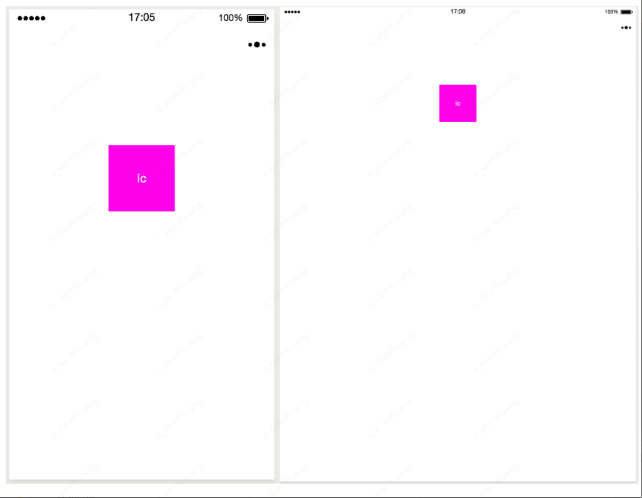
In WXSS, the rpx (responsive pixel) size unit is introduced. The purpose of referencing the new size unit is to adapt to screens of different widths and make development easier.
As shown in the figure below, if px is used as the size unit for the same element on screens of different widths, it may cause too much white space on the page.
Change to rpx size unit, the effect is shown in the figure below.
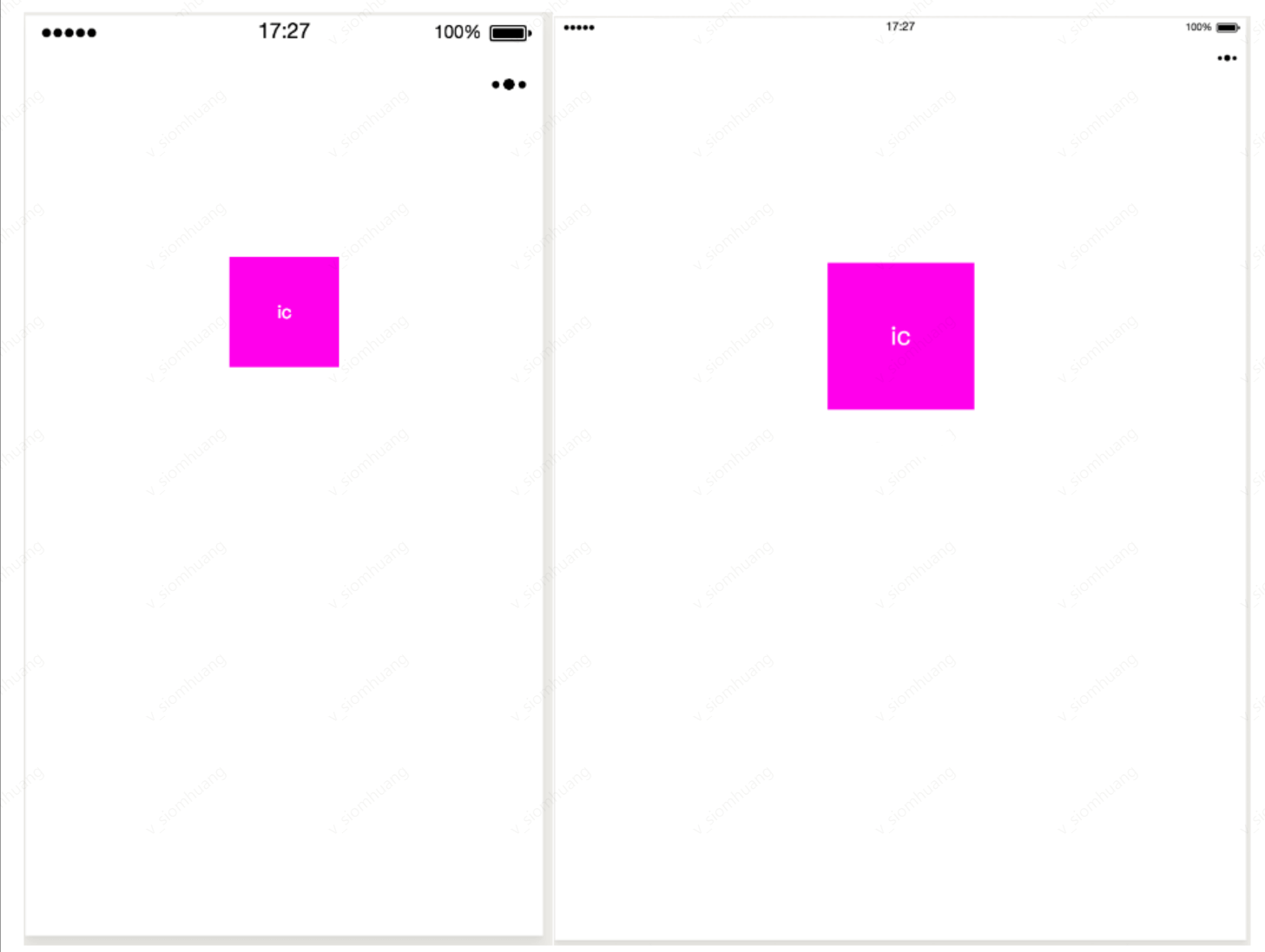
After the applet is compiled, rpx will be converted to px based on 375 physical pixels, that is, on a screen with a width of 375 physical pixels, 1rpx = 1px.
For example: the screen width of iPhone6
WXSS reference
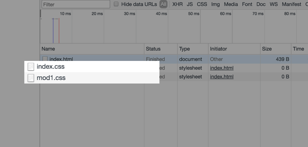
In CSS, developers can reference another style file like this: import url('./test_0.css')
This method will not merge test_0.css into index.css in the request, that is, when requesting index.css, there will be an additional request for test_0.css.
In the mini program, we can still implement style references. The style reference is written as follows:
js
@import './test_0.wxss'Since WXSS will eventually be compiled and packaged into the target file, users only need to download it once, and no redundant file requests will be generated during use due to style references.
Inline style
WXSS inline style is consistent with Web development:
js
<!--index.wxml-->
<!--Inline style-->
<view style="color: red; font-size: 48rpx"></view>
Mini programs support dynamic updating of inline styles:
js
<!--index.wxml-->

<!-- Dynamically changing inline styles-->
<!--
{
  eleColor: 'red',
  eleFontsize: '48rpx'
}
-->
<view style="color: {{eleColor}}; font-size: {{eleFontsize}}"></view>
Selectors.
The currently supported selectors are shown in the following table.
Type
Selectors.
Example
Example description
Class selector
class
.intro
Select all components with class='intro'
ID selector
#id
#firstname
Select components with id='firstname'
Element selector
element
view checkbox
Select all view components and all checkbox components in all documents
Pseudo-element selector
::after
view::after
Insert content after the view component
Pseudo-element selector
::before
view::before
Insert content before the view component
WXSS priority is similar to CSS, and the weight is shown in the figure below.
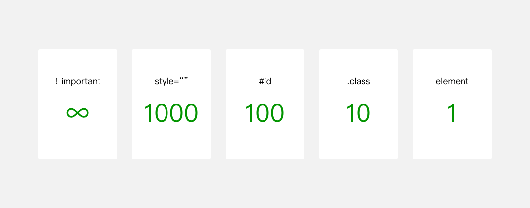
The higher the weight, the higher the priority. In the case of the same priority, the style set later has a higher priority than the style set earlier.
WXSS selector priority weight, the code is as follows:
js
view{ // Weight is 1
  color: blue
}

.ele{ // Weight is 10
  color: red
}

#ele{ // Weight is 100
  color: pink
}

view#ele{ //Weight 1 + 100 = 101, highest priority, and element color is orange
  color: orange
}

view.ele{ // Weight is 1 + 10 = 11
  color: green
}
Official style library
In order to reduce the workload of developers in style development, we provide the WeUI.wxss basic style library.
WeUI is a basic style library consistent with the native visual experience of Luffa. It is designed by the official Luffa design team for Luffa internal web pages and Luffa mini-programs, making the user's usage perception more unified. It includes various native styles such as button, cell, dialog, progress, toast, article, actionsheet, icon, etc.